Do you add screen shots to your tech writing? Do you always do them a certain way?
Screen shots can save the day
Rather than explain where to find a button, we can just show the reader exactly where the button is. Picture, thousand words, you know the score.
But screen shots can also get in the way. They can dominate a page, pushing your hand-crafted text way up or down, and they can make your readers scroll to find bits and pieces of steps squished between images.
Big screen shots in particular can make the entire document longer, which adds to the sense of unease that most people have when consulting the help.
There has to be a balance. Here are some of my thoughts on using screen shots appropriately, and some tips for reducing the physical and digital space they take up.
Show specific things, not general things
If you’re writing about a particular part of a complex dialog box, then a screen shot can save you and your readers a headache. Take a picture and point out the the section you mean.
But if you’ve just said, “the XYZ window appears, then there’s probably no reason to take a screen shot. They already have the actual window on their screen, and presumably it’s labelled.
It also makes sense to show interface elements that go against what the reader expects. That is, if the program has an unusual way to save a change, then a screen shot may be helpful. If it’s a matter of clicking File and then Save, then I wouldn’t bother.
Crop tightly. But not too tightly
Sometimes you need to show a whole dialog box or window. But many times, it makes more sense to crop out the irrelevant stuff and show just what you need.
The key here is to tune how tightly to crop the image. You want to get rid of the unnecessary parts, but leave enough for the reader to stay oriented. You don’t want them wondering where on the screen to find the image you’ve shown them.
For example, Microsoft Word has a little combo box for controlling the size of a font. Let’s say I want to tell the reader to click it. Rather than drop in a big screen shot showing my whole Word doc, I could take a much tighter shot:
I think that’s a bit too close. Although the reader could probably find that combo box, I’d rather back out a bit to let them see the landscape. Something like this works better:
Now, the reader can find the box a lot faster. With the right software, you can do all kinds of nifty stuff to highlight the area that you’re showing. For example, you could blur the surrounding interface, or make it gray. Or just draw a box, like I did. Either way, you’re showing them the element they need, without making them scan a large image with lots of little bits.
Get rid of title bars
This tip isn’t always necessary, but can come in handy. Have you ever noticed that the Edit screen of some programs looks identical to the Add screen? Identical, that is, except for the title bar, which says “Edit” instead of Add.
Developers often use the exact same code to build different parts of a program that share functionality. This makes perfect sense, and we can use that fact to our advantage.
I’ll often crop a screen shot so that it doesn’t show the title bar. Then, I can reuse that image for any screen that looks the same.
Get rid of dead space
It’s easy enough to crop, but sometimes you do need to show the whole screen. What can you do then?
The simplest thing is to just shrink the picture once you’ve taken it. Any tool that allows you to place an image among text probably includes a feature to shrink it. Shrink it too much and it becomes unreadable, of course, so be wary.
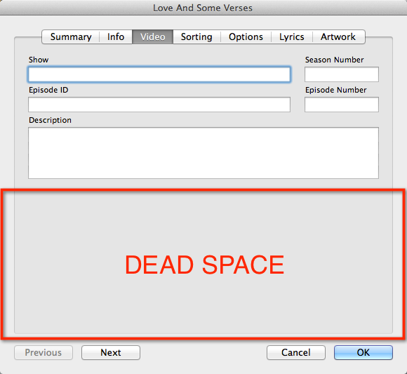
With a little more effort, you can sometimes shrink an image without really shrinking it. You do this by deleting the dead space. Here’s what I mean.
The image below shows the “Info” screen for a song in iTunes. Maybe I need to show that whole screen, but I definitely don’t need all that dead space in the middle.
In this case, I’d move the bottom part of the screen up so that it fits just under the part of the interface that is NOT dead space. Then I’d crop it.
That leaves me with the image below, which gives the reader all the detail of the page, but none of the dead space. Note that I got rid of the title bar as well, so I can show this screen for any song, not just the one I took the picture of.
Of course, this screen no longer looks exactly like the one that the reader sees. There’s a bunch of dead space missing. But I think it’s ok. Very few people will be confused, and most people will be glad to have smaller images onscreen.
So what do you think? Am I getting this all wrong? Do you have tips or tricks that people should know about?


Nice article, Robert.
I have removed dead space in images several times. I haven’t had any issues from reviewers or end users on that.
Thank you for blogging about these.
Thanks for your comment. Good to know that others are doing the same things with the same results.