Do you write UI copy? If so, what tools do you use? How do you deliver it?
Here’s what I’ve been doing:
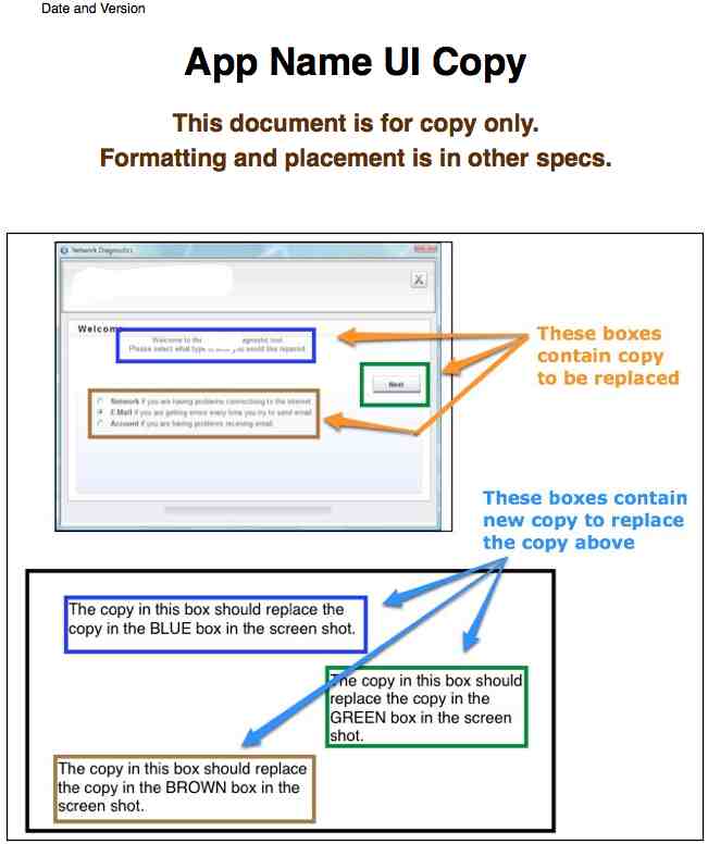
- Get images or screenshots of the UI that needs copy.
- Place the images in Pages (a Word processing/layout app for the Mac. You could use Word).
- Inside each image: Draw colored boxes around the copy I’m changing. Each block of text gets a different color.
- Below each image: Draw boxes to match the colors and general position of the boxes in the image above.
- Fill in the boxes below the image with the copy I want to use.
- Deliver it as a PDF, with an explanatory first page.
The explanatory first page looks like this:
Thoughts:
- Developers can copy and paste from the boxes below the images. No typing and no typos.
- It’s obvious which copy needs to be changed and which doesn’t.
- Product Managers and other stakeholders get an idea of the copy and placement.
- I don’t spend much time with layout. I just put the boxes sort of where they should go.
- Color-blind developers? I’m not sure what changes I’d have to make.
- Converting from or to Word can screw up the boxes, so check the doc if you have to convert.
Does this method make sense to you? Is there a better way? How do you deliver UI copy?


At a previous job, the tech comm team was closely aligned with the UX team. The UX team used Axure to create wireframes of the UIs, and then tech comm edited the interface text in the wires. That way, the developers got one deliverable – a set of wireframes with the accurate text. It helped with spacing the text too. The wires were definitely just an estimate and not pixel perfect, but they illustrated page layouts really well.
Additionally, tech comm used the annotations feature in Axure to mark any text that was conditional. For example, if a message changes depending on the scenario, tech comm could note that in the annotations.
Axure.
I’ll have to look into that. So, do your writers and UX people all have Axure licenses? What’s the output? (I think I was something about it being HTML.)
[Incidentally, I should have noted in the “Thoughts” section that my method above allows for one deliverable as well. The UI and Copy is all together, but it’s not as pretty as it could be.]
I give UI text feedback to developers, and you’ve given me something to think about and implement.
Re: color, how about numbering?
Ben, I could see using numbers as well. I personally like the colors, which I think make it easy to see what’s going on without engaging the brain too much.
Maybe a combination would work well.